AEVOS PERFORMANCE
A brand identity for a pro-athlete startup

Aevos Performance is a UK-based startup founded by former professional athletes James McLaughlin
(cycling) and Oliver Hoskins (rugby). Their mission is to bring elite sports mindset, teamwork principles, and high-performance culture into modern businesses. With no existing visual identity, they approached Wood & Ham to build their brand from the ground up, ensuring it could scale globally and adapt across multiple industries and cultures.
CLIENT TYPE
Performance Consultancy
WHAT WE DID


The Challenge
As a completely new venture with ambitious plans for international growth, the challenge was to create a brand that honoured James and Oliver’s elite sporting heritage while feeling relevant and credible to corporate audiences. The identity needed to be flexible enough to work across different countries, industries and cultures, all while remaining simple, consistent, and easy for them to roll out themselves.
With two founders from different sporting disciplines and a business model that blends mindset training, leadership development, and team dynamics, clarity was essential. The name, strategy, and visual identity all needed to work together to tell a cohesive story.

Our Work
We began with a series of in-depth brand strategy workshops to understand the founders’ values, points of difference, and long-term aspirations. These sessions helped shape the direction of the brand and set the foundations for the naming process.
Naming: James and Oliver wanted a name that reflected transformation, resilience, and the idea of being “reborn” through elite performance. After exploring a range of routes, Aevos was chosen, a name which was a nod to their desire to 'maximise human potential' with EVO (evolution) and OS (human operating system). With close alignment to the mythology of the phoenix, symbolising renewal, clarity, and the momentum of starting again with purpose.
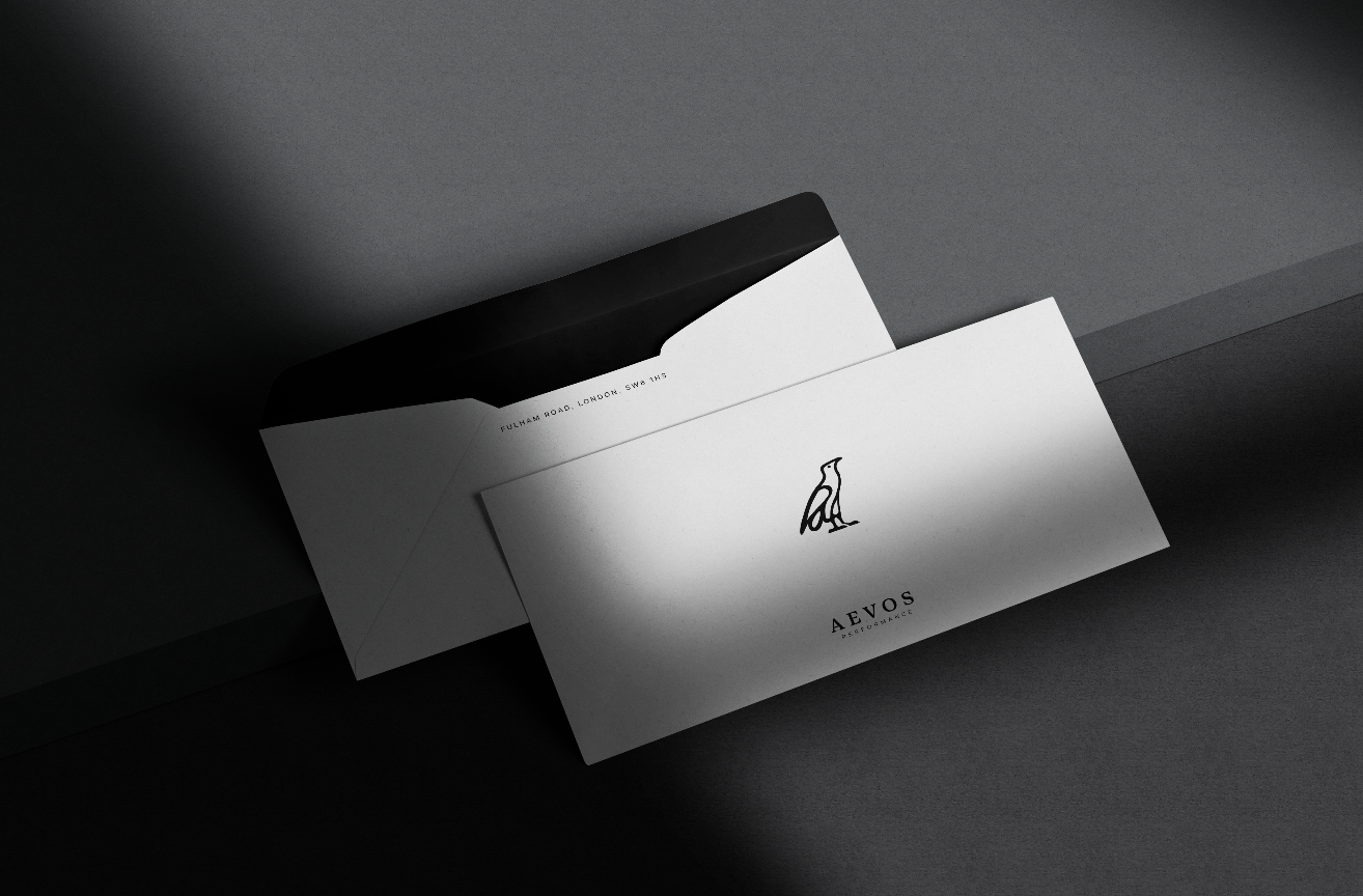
Identity development: We then created a complete visual identity system for Aevos Performance. The brand was built around a monochromatic palette to ensure simplicity, professionalism, and global applicability. We developed a suite of hand-illustrated phoenix-inspired icons, giving the brand a distinctive symbol that captures its heritage. The typography, structure and visual language were all designed to give Aevos a modern, straightforward, and confident feel, mirroring the founders’ approach to performance coaching and behavioural change.
Practicality and scalability: As Aevos plans to grow internationally and work across a wide range of industries, the identity needed to be flexible, robust, and easy to apply consistently. We built a visual system that is straightforward to reproduce and simple for the founders to roll out across future materials, ensuring the brand can scale confidently as the company expands.


The Outcome
Since launch, Aevos Performance has already secured engagements with major national organisations, with the new brand playing a key role in establishing early credibility. The identity has translated seamlessly across apparel, workshop collateral, and digital touchpoints, enabling the founders to present a unified and professional front as they grow their client base.
The combination of strategic clarity, consistent design, and a flexible identity system has given Aevos a strong foundation for the next phase of its journey, positioning them as a new, confident voice in the world of performance consultancy.


