Gromore: Building a Platform for Inclusive Performance
- Lewis Woodham

- May 18
- 3 min read
Gromore is a performance-led consultancy and digital platform created to transform opportunities in tennis for people with physical impairments.
Founded by Ross Cudmore and Matt Grover, Gromore brings together lived experience, sporting knowledge and a clear ambition to create meaningful change within para tennis. With a focus on performance, access and opportunity, the organisation exists to help shape a more inclusive future for the sport.
As a new organisation with a powerful mission, Gromore needed a brand identity that could communicate its purpose with clarity and confidence. The challenge was to create a visual identity that felt professional, credible and performance-led, while still reflecting the human impact at the heart of the organisation.
Wood & Ham worked with Gromore to develop a new brand identity from the ground up, creating a flexible visual system designed to support the organisation across consultancy, digital platforms, partnerships, presentations, social media and future event applications.


The Challenge
Gromore was entering the tennis landscape with a clear and ambitious purpose: to transform opportunities in tennis for people with physical impairments. The organisation needed an identity that could match the scale of that ambition. It had to feel professional enough to engage partners, stakeholders and sporting organisations, but also human enough to reflect the personal experience and purpose behind the brand.
For Ross and Matt, Gromore was not simply a business idea. It was built from a deep understanding of the barriers that can exist within sport, and a desire to help create better pathways, better support and better opportunities for players with physical impairments.
The brand therefore needed to balance several important qualities. It had to feel performance-led, but not cold. Inclusive, but not soft. Modern, but not trend-led. Confident, but not corporate for the sake of it.
It also needed to be flexible. As a consultancy and digital platform, Gromore would need to appear across a wide range of touchpoints, from digital interfaces and social media to partnership documents, presentations and future event materials. The identity had to be simple enough to use consistently, but distinctive enough to give the organisation a strong and recognisable presence.


Our Work
We began the project with a collaborative workshop process, working closely with Ross and Matt to understand the purpose, values and long-term direction behind Gromore.
These early conversations were an important part of the project. They helped us explore not only what Gromore does, but why it exists, who it is designed to support, and how the brand needed to make people feel.
From there, we developed a strategic visual identity built around clarity, movement and progression.
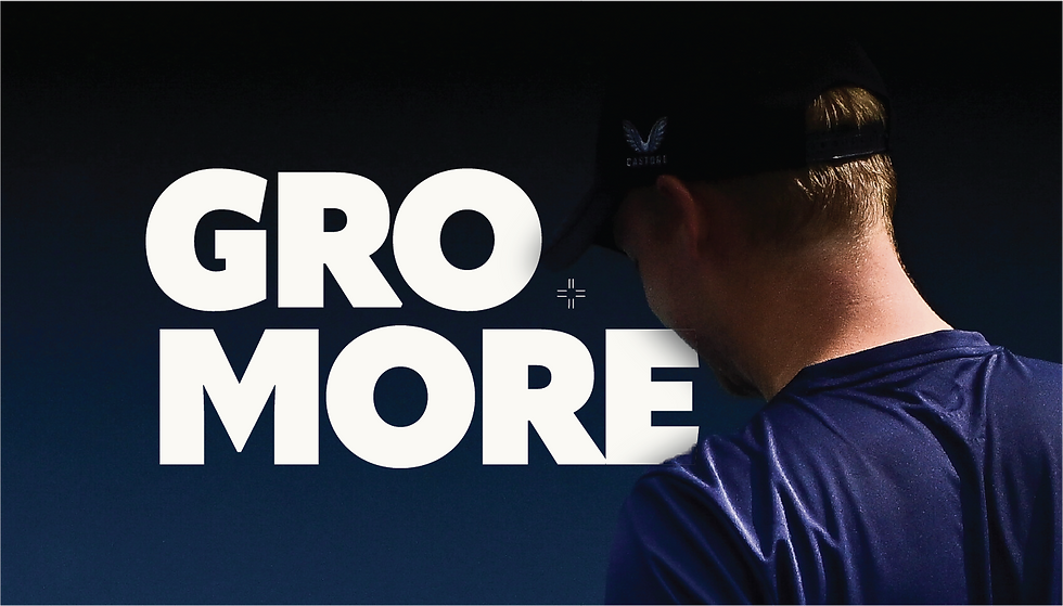
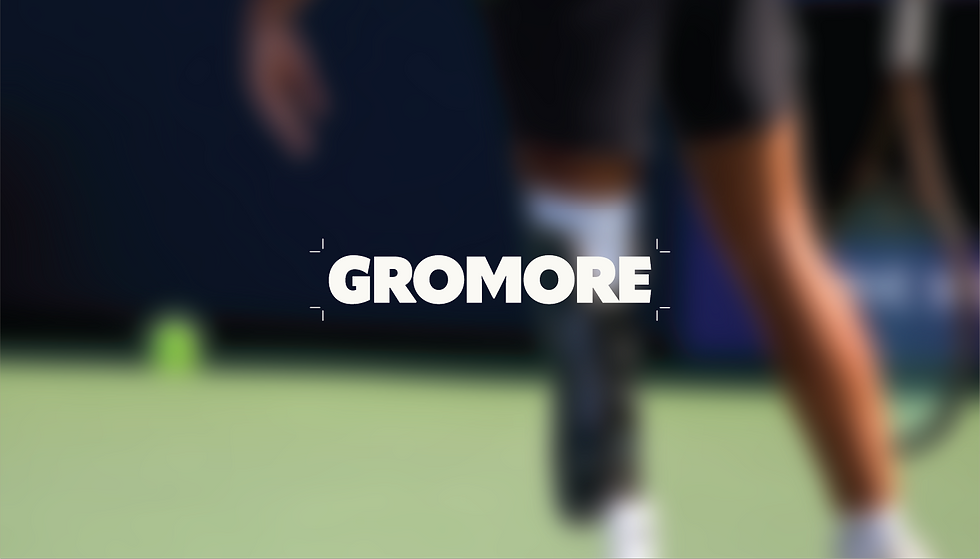
The final identity included a refined logo system, monochrome colour palette, typography direction and a flexible visual language that could be applied across different brand materials. The monochrome palette was chosen to create a sense of strength, professionalism and focus, giving Gromore a confident foundation that could sit comfortably within both sporting and consultancy environments.
Alongside this, we developed a supporting graphic system designed to introduce energy and momentum throughout the brand. The use of structured shapes and directional visual elements helped reflect the idea of movement, progress and performance, while giving Gromore a distinctive design language that could evolve with the organisation.
A key part of the work was ensuring the identity felt practical and scalable. Gromore needed a brand system that could work across digital platforms, presentations, partnership documents, social media and future event applications without becoming overly complicated or difficult to manage.
The result was a clean, focused and adaptable identity that gives Gromore the tools to communicate consistently as the organisation grows.

The Outcome
The final identity gives Gromore a confident and future-facing platform from which to grow.
The brand now reflects the performance-led nature of the organisation while also capturing its wider purpose: to create better opportunities in tennis for people with physical impairments.
With a clear visual system and flexible brand foundations in place, Gromore is now better equipped to communicate with athletes, partners, stakeholders and the wider tennis community.
The identity provides a strong platform for the next stage of the organisation’s journey, helping Gromore present its mission with clarity, professionalism and purpose.
For Wood & Ham, this was a project rooted in both strategy and meaning. It was about creating a brand that could support real change, giving Gromore the confidence and consistency it needs to help shape the future of inclusive performance in tennis.
If you would like to start a project with Wood & Ham, just get in touch HERE.
