Bringing Inclusion to Life Through Design: Our Work on ‘Inclusive Hotspots’
- Lewis Woodham

- Jul 18, 2025
- 1 min read
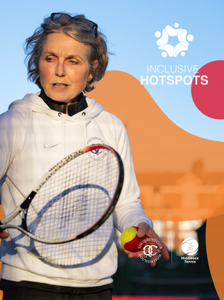
We were thrilled to once again collaborate with The Queen’s Club Foundation on a meaningful new initiative with Middlesex Tennis to develop a visual identity for Inclusive Hotspots.
Inclusive Hotspots is a programme designed to use tennis as a tool to improve social inclusion, support wellbeing, and foster deeper community connections. It’s a project rooted in positive impact, and we were honoured to help bring it to life.

Our brief was clear: create a brand identity that felt approachable, impactful, and above all, inclusive. We began by exploring the initiative’s five core objectives and building a visual language around them. The resulting logo features soft, curved forms that communicate openness and accessibility - a reflection of the programme’s welcoming spirit.
Equally important was ensuring the design sat comfortably alongside the existing identities of both The Queen’s Club Foundation and Middlesex Tennis. We crafted a complementary colour palette that could flex across all three brands without losing its own character or clarity.

At its heart, Inclusive Hotspots is about opening doors. It’s about giving more people the chance to connect, be active, and feel a sense of belonging through sport - and we’re proud to play a small part in that mission.
We can’t wait to see the difference this initiative makes, and it’s another reminder of why we love what we do. When sport and design come together with purpose, powerful things happen.


