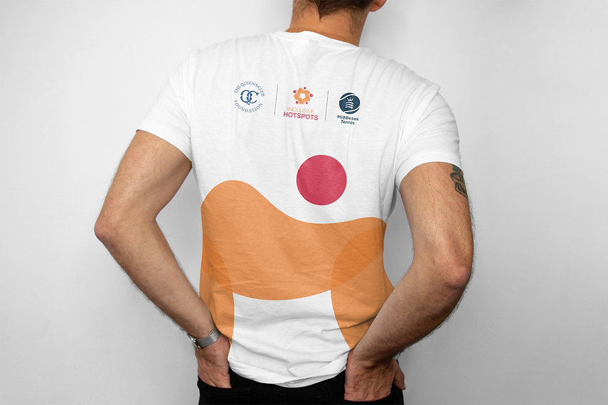
Inclusive hotspots
Visual Identity
We were asked by The Queen's Club Foundation to develop a visual identity for their latest initiative, created in collaboration with Middlesex Tennis. Entitled Inclusive Hotspots, the programme is designed to enhance social inclusion, health, and community engagement through tennis.
The identity needed to feel approachable and impactful, but above all, inclusive. With this in mind, we created a logo built around soft, curved forms and rooted in the initiative’s five core objectives. It was equally important that the design complemented both the Queen’s Club Foundation and Middlesex Tennis identities, so we developed a colour palette that harmonised seamlessly with both.
We are genuinely excited to see the positive impact Inclusive Hotspots will have within the community and another reason why we love the power of sport!!


