top of page
GROMORE
A platform for inclusive performance

Gromore is a performance-led consultancy and digital platform created to transform opportunities in tennis for people with physical impairments.
Founded by Ross Cudmore and Matt Grover, the organisation brings together lived experience, sporting ambition and a clear desire to help shape a more inclusive future for tennis. With a focus on performance, access and opportunity, Gromore needed a brand identity that could reflect both the professionalism of its work and the human purpose behind it.
CLIENT TYPE
Sports Consultancy
WHAT WE DID


The Challenge
Gromore is a performance-led consultancy and digital platform created to transform opportunities in tennis for people with physical impairments.Founded by Ross Cudmore and Matt Grover, Gromore was built around a clear ambition to create meaningful change within para tennis, combining lived experience, sporting knowledge and a long-term vision for greater access, opportunity and performance support.
As a new organisation with a powerful mission, Gromore needed a brand identity that could communicate its purpose with clarity and confidence. The challenge was to create a visual identity that felt professional, credible and performance-led, while still reflecting the human impact at the heart of the organisation.
The identity also needed to be flexible enough to support Gromore as it grows, working across digital platforms, consultancy materials, presentations, partnership documents, social media and future event applications.

Our Work
Wood & Ham worked with Gromore to develop a new visual identity from the ground up.
The project began with a collaborative workshop process, helping us understand the organisation’s purpose, values, ambitions and long-term direction. These conversations helped shape the strategic foundation of the brand, ensuring the final identity reflected not just what Gromore does, but why it exists.
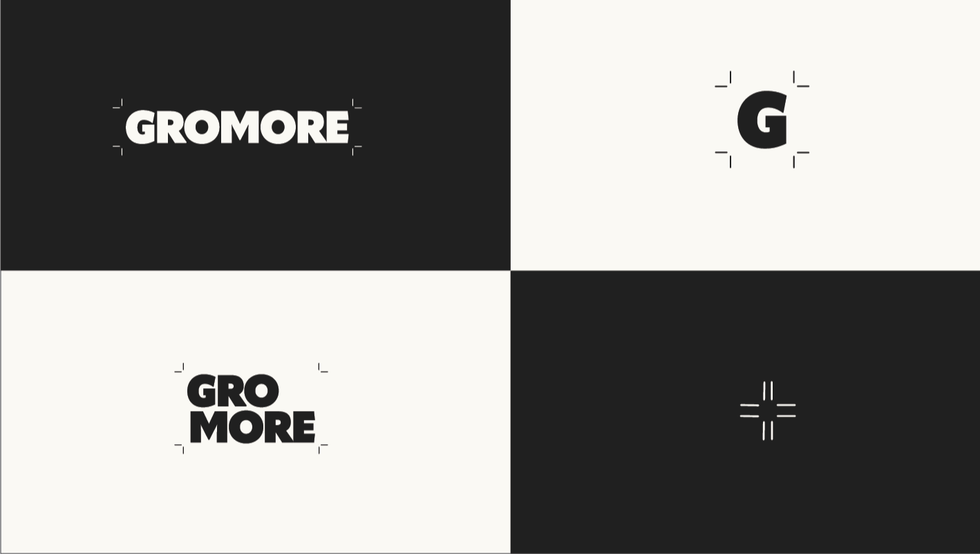
From there, we developed a refined visual identity built around clarity, movement and progression. This included a logo system, monochrome colour palette, typography direction and a flexible visual language designed to feel strong, focused and adaptable.
The monochrome palette helped create a sense of confidence, professionalism and inclusivity, while the supporting graphic system introduced energy, structure and a sense of focus across the brand. Every element was designed to give Gromore a consistent and recognisable presence across both digital and physical touchpoints.


The Outcome
The final identity gives Gromore a confident and future-facing platform from which to grow.
The brand now reflects the performance-led nature of the organisation while also capturing its wider purpose: to create better opportunities in tennis for people with physical impairments.
With a clear visual system and flexible brand foundations in place, Gromore is now better equipped to communicate with athletes, partners, stakeholders and the wider tennis community, helping the organisation present its mission with clarity, professionalism and purpose.


bottom of page